

Frutiger Aero: the Trend of 2024?
Could Frutiger Aero become the trend of the year in 2024?
Frutiger Aero generates tens of millions of results across the internet, appearing on platforms like YouTube, Reddit, TikTok, and in media outlets such as The Guardian and the Consumer Aesthetics Research Institute (Cari).
With dedicated Subreddits and Discord communities, Frutiger Aero is the subject of numerous tutorials, playlists, thousands of hours of commentary, and countless Pinterest boards, all indicative of its passionate fan base.
But what exactly is Frutiger Aero, why has it gained such popularity, and is it on track to become the defining trend of 2024?
What is it?
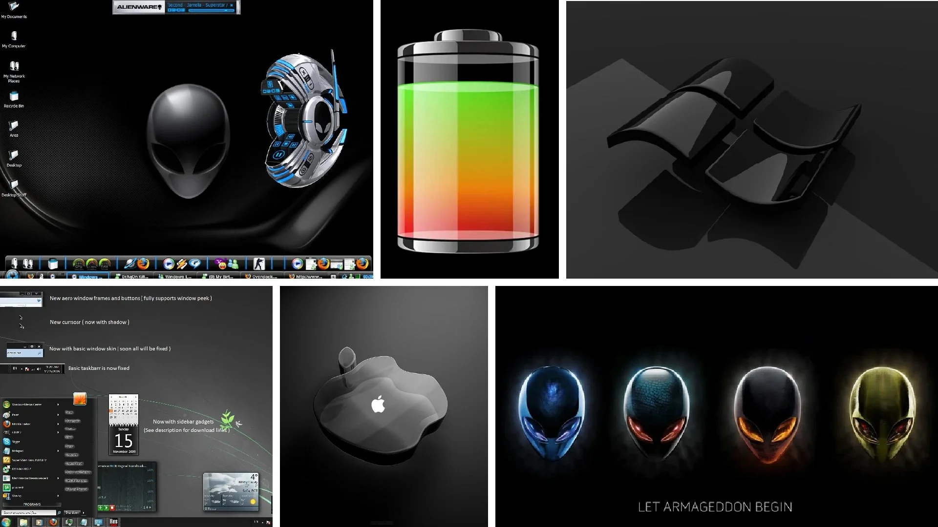
Even if you are not familiar with the name, you have likely encountered the glossy textures, skeuomorphism, clear skies, tropical fishes, soap bubbles, glass, lens flare, bokeh, Frutiger fonts, auroras and bright, vibrant colors that define Frutiger Aero. This design style and aesthetic, also known as Web 2.0. Gloss, was prevalent from 2004 to 2013, immediately following the Y2K era.

Frutiger Aero
Frutiger Aero originates from the Windows Aero design language, introduced with Microsoft’s Windows Vista. The trend’s name was coined by Amsterdam-based visual artist Sofi Lee in 2017, and it is derived from this Microsoft design language and Adrian Frutiger’s last name.
Adrian Frutiger, the designer of this sans-serif font family, as well as Univers and Avenir, had a major influence in graphic design in the 20th century and is credited with the advancement of traditional written typography into digital typography.
Related Trends
Frutiger Aero has many related aesthetics, some of which are Frutiger Eco, Frutiger Metro, Helvetica Aqua Aero and Dark Aero. Although these sub-genres may share traits with Frutiger Aero, they are distinct enough to be considered separate visual styles in the larger Frutiger family.

Frutiger Eco

Surf Crush

Helvetica Aqua Aero
Dark Aero

Frutiger Metro

Four Colors
The emergence of various related aesthetics within the Frutiger family is a natural evolution of design and the culture created around it. Various communities adopted and adapted the style to represent their unique socio-cultural identities and aesthetic values.
This collection of design styles isn’t just about visual appeal, which is, of course, subjective. Critics often describe the aesthetics as objectively bad, cluttered, lacking substance, too bright and childish. However, it’s important to note that there is no definitive rule on what looks good and bad. Additionally, such quick dismissals fail to grasp the depth of emotions people find in the style.
The humanistic aspect of Frutiger Aero is one of the most important characteristics in every description of the style. Companies designed cheerful sounds, tactile textures, nature-inspired wallpapers, to create an accessible experience and make the new technology of the 2000s approachable, intuitive and user-friendly.
Skeuomorphic design played a crucial role in the digital literacy. It was used to ease the shift from the 1990s computers and devices to the more advanced and powerful counterparts of the 2000s.
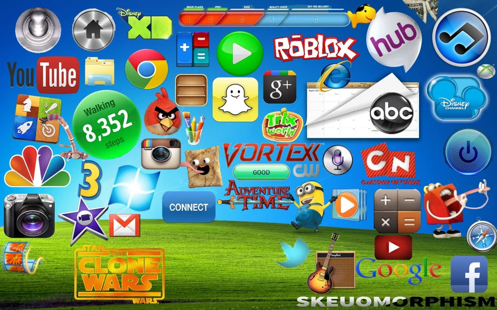
Skeuomorphic design
This style, which features a real-life looking icons like a bin for trash, a floppy disk for saving and a manila folder for folders, intentionally emulates real-life objects to make digital interfaces friendlier and easier to understand. These representations of real-world objects helped users feel more confident and comfortable using new technology.
Moreover, humanism in this context also refers to the emotional connection fostered between users and the optimistic nature, joyful motifs and vibrant colors of the Frutiger family. Humanism emphasizes creating user-centric interfaces that prioritize the needs and experience of human users. This stands in contrast with the cold, sterile and clean minimal design trends that followed.

Frutiger Aero Reddit Interface
Why is it on the rise?
Although it was in every UI design from 2004 to 2013, Frutiger Aero did not spread into popular culture at the time. It remained a visual language largely limited to corporate design, computers and electronics. Many people did not know about Frutiger Aero, or discuss it, until recently. So, what are the factors driving its resurgence?
Devotees of the style often cite several reasons. Firstly, there’s nostalgia. Frutiger Aero symbolizes an optimistic future that never fully materialized. It envisioned and gave us hope for a world with 100% sustainable energy, lush green landscapes, pristine waterways and communities working together to make the world a better place. In 2024, this future feels increasingly distant, igniting a nostalgic longing for the utopian future cherished by many, especially gen Z youth, during their formative years.
Moreover, Frutiger Aero evokes a familiarity similar to rewatching a treasured childhood movie, providing a nostalgic escape from the monotony of today’s corporate flat designs.

This strong push against minimalism from younger generations has taken various forms in previous years as well, namely wavy checkered patterns, bold colors and textures, as well as abstract patterns. The rise of Frutiger Aero serves as a perfect example of this ongoing pushback.
Additionally, Frutiger Aero emerged on the heels of the Y2K era, making its resurgence in 2024 a natural next step after the Y2K revival of 2023. Frutiger Aero seems to once again demonstrate the recurrent nature of design trends, oftentimes observed in 20-year cycles. However, beyond nostalgia and the cyclical resurgence of trends, we can clearly see a strong pushback from gen Z against modern cynicism.
A generation characterized by activism, social awareness and a desire for positive change, gen Z looks for optimism in design and popular culture, a sentiment absent in the current global landscape. Frutiger Aero serves as a beacon of hope and positivity in an era marked by political turmoil, environmental crises, and social unrest.
“It reflects a sort of skepticism towards late stage capitalism and a longing for an unrealized future .”
In summary, Frutiger Aero’s resurgence reflects not only cyclical trends and nostalgia but also the collective desire for optimism and positivity in design. As Gen Z challenges modern cynicism and seeks to shape a better future, Frutiger Aero stands as a symbol of hope and possibility in an uncertain world.

Frutiger Aero Desktop Layout
Is Frutiger Aero the trend of 2024?
Frutiger Aero’s potential as the trend of the year is dimmed by several factors. Concerns about corporate greenwashing, the sense of cynicism and fatalism in society, as well as the tendency to dismiss gen Z trends as immature and impractical, could all limit its appeal to broader audiences.
From a commercial standpoint, Frutiger aero’s visual complexity, limitations in adaptability, and appeal to primarily younger generations rather than audiences of all ages pose challenges to mainstream adoption of the style. These are particularly significant deterrents for companies in the tech sector, which have strong financial incentives to appeal to all audiences.
While it’s difficult to predict whether Frutiger Aero will dominate 2024, there has been an incontestable spike in its presence across many platforms in the past few months. Just as Y2K made a comeback in 2023, some version of Frutiger Aero could gain prominence this year. The push against minimalism and flat design suggests a potential shift towards more dynamic and visually engaging design elements.
So, while we might not revert to the tropical fish, bright green wallpapers and glass morphism of the early 2000s, we could continue to witness a decline in flat corporate style and a shift towards vibrant bold designs.
Ready to dive deeper into creative inspiration and design trends? Read more of our articles and check out our design work. If you’d like to work with us, schedule an intro call and let’s make magic happen.
Let’s bring your vision to life.