

Design Concept: Kanmi Chocolate
Design concept for Kanmi Chocolate: visual identity and packaging
Kanmi Chocolate is a chocolate and confectionery concept we developed as part of our creative exploration process. We took inspiration from Japanese art and Western playful color palette, and set forward to create a brand unlike any other on the market. In this article, we want to take you through our process and give you some insights into the steps we took to bring Kanmi to life.
Read along as we talk about the Kanmi Chocolate concept design process.

Kanmi Chocolate — Chocolate bar wrapper

Kanmi Chocolate — Pralines mix box
Inspiration & Objective
The term Kanmi Chocolate is a romanization of the Japanese word 甘味 (かんみ), which translates to sweet or sugary. The visual style we chose is inspired by Ryo Takemasa's illustration work, and incorporates a kid-friendly playful color palette, typical for Western chocolate and confectionery companies. On top of that, we were inspired by some uncommon chocolate flavor combinations.
Using these three inspiration sources as our starting point, our goal was to build a well-defined and engaging concept. We wanted to create a friendly, joyful and colorful visual language that could potentially appeal to people of all ages. We settled on two key strategies to achieve this objective: draw attention with the striking color palette and maintain interest with the unique chocolate flavors.
For this project, we settled on five flavors: Lavender Honey, Raspberry Rose, Hazelnut Fig, Orange Coffee and Chilli Lime. Each flavor offers a unique combination of ingredients, so there are plenty of interesting possible choices. We also considered several noteworthy options that didn’t quite make the final cut. Here are some honorable mentions: Sea Salt Caramel Pretzel, Coconut Lime, Peanut Butter Jelly, Rosemary and Olive Oil. You get the idea.

Kanmi Chocolate — Chocolate bar wrapper
Design Vision
As a concept, Kanmi is as boldly expressive in flavors as it is in design. We went for a friendly, joyful, uncomplicated and accessible brand identity because we wanted to create an experience that could resonate with a wide audience, from children to adults.
Premium materials. To indicate trustworthiness and elegance, we imagined Kanmi with the highest-quality materials such as sturdy boxes, glossy finishes, and embossing. These design elements elevate a product’s appeal and convey quality and craftsmanship.
Stylized natural elements. Incorporating natural elements like lime slices, hazelnuts, chocolate pods or raspberries into our design was central to our vision. We imagined Kanmi as a modern brand focused on quality that uses real natural ingredients in the products.
Distinct variation. Our design uses bright colors with distinct variation and strong contrast to stand out prominently on retail shelves. The bold colors were strategically chosen to create visual impact and instantly and clearly communicate flavor distinctions.
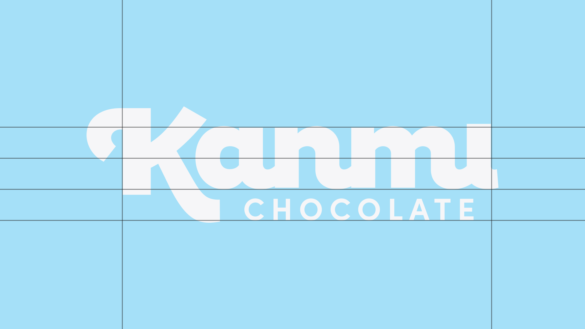
Kanmi Chocolate — Logo design grid

Kanmi Chocolate — Logo design variations
The Design Process
Step 1. Core identity
Defining Kanmi Chocolate's core identity is the first step in our design process. This begins with establishing brand values, identifying the target audience and articulating the brand’s overall personality. This initial step is essential because the brand’s mission and ethos ultimately serve as the guiding principles that influence all subsequent design choices.
Step 2. Font combination
Given Kanmi’s word mark logo typology, selecting the right font combination was crucial for achieving our brand's intended aesthetic and ensuring its affiliation with the food and sweets industry.
Confiteria Script was chosen for the brand name to evoke the idea of gourmet chocolate, craftsmanship and premium quality. The handwritten style confers a distinctive handmade touch, consistent with the brand’s commitment to excellence.
In contrast, Sofia Pro Bold, a modern sans-serif with clean lines, was our choice for the secondary font. Its contemporary look enhances readability and clarity, while balancing the organic, rounded forms of Confiteria Script.
By pairing these two typefaces, we were able to ensure harmony and modernity, making the full logo version both visually pleasing and functional.
Step 3. Logo variations
In today’s dynamic branding landscape, the necessity of having at least one logo variation cannot be overstated. Whether used in digital media, packaging or print, different versions of a logo allow it to maintain its integrity and legibility while accommodating various platform or media constraints.
Step 4. Color palette
It was essential for us to define a cohesive color palette to set the tone and mood for Kanmi Chocolate. The colors we chose resonate with the brand’s personality and convey qualities like joy, playfulness and indulgence.
Step 5. Illustration
Our brand concept heavily relies on the stylized illustrations of fruit, flowers, nuts, chocolate and coffee pods. These visual symbols serve as key elements for communicating the product’s natural ingredients, while also adding an artistic quality to the overall design.
These stylized illustrations, which draw inspiration from the product ingredients, effectively capture the essence of each food item in a simplified yet evocative manner.
Step 6. Packaging
Ultimately, the goal we set for this creative experiment was Kanmi Chocolate bar and praline packaging, which served as the canvas to bring all the individual design elements together. The design we created essentially communicates the chocolate brand’s core values and brand identity.
We wanted to redefine each wrapper and praline box to serve as a piece of art — a beautiful gift for a loved one or a decadent treat for yourself. We achieved this by prominently integrating the illustrations into our packaging.
Furthermore, we prioritized the aesthetic appeal of the design, deliberately allowing the patterns to take up most of the space on the boxes and wrappers. Additionally, the large, distinctive patterns help consumers easily identify, remember and recognize their preferred flavors, improving the overall shopping experience.

Kanmi Chocolate — Logo and color variations

Kanmi Chocolate — Logo and color variations
Applications and Future Perspectives

Kanmi Chocolate — Logo variations for sub-brands
We envision Kanmi Chocolate as a brand with versatile potential for expansion into other niches. Similarly to FedEx’ brand hierarchy, our design strategy allows for ease of adaptation when branching out into other markets. Kanmi branding not only allows, but facilitates seamless adaptability, whether breaking into other food sectors like savory snacks and beverages, or exploring entirely different industries such as toys and theme parks.
Moreover, the one-letter icon is simple, unique, easily identifiable and recognizable, which makes it readily transferable to all potential business sectors. The distinct Kanmi icon transcends language and cultural barriers, which helps preserve brand coherence, enhance memorability and increase brand visibility across all platforms and media.
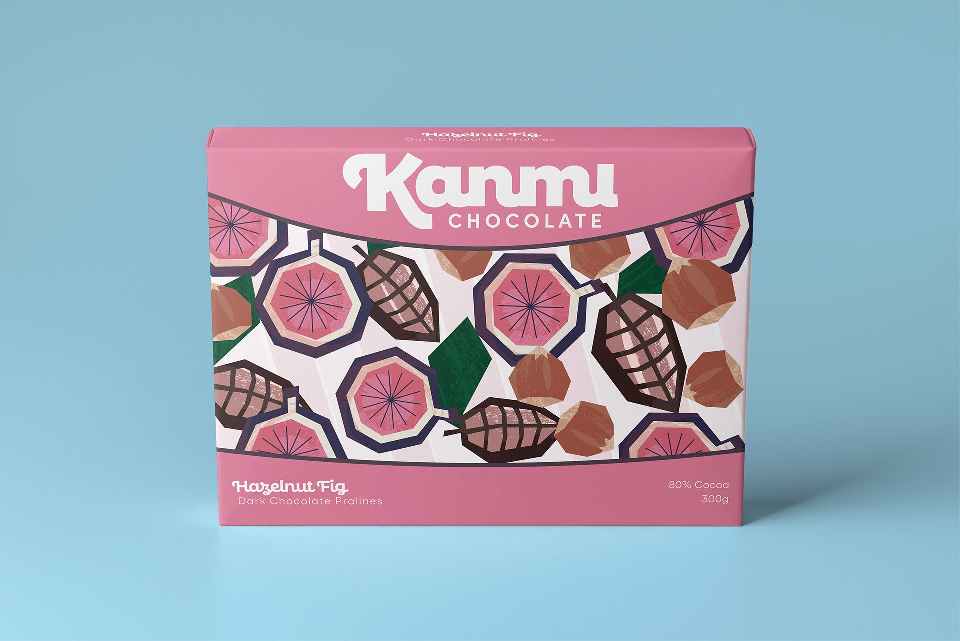
Kanmi Chocolate — Hazelnut fig pralines box

Kanmi Chocolate — Raspberry rose pralines box

Kanmi Chocolate — Lavender honey pralines box
Bottom Line
Kanmi Chocolate represents a well-balanced blend of unexpected flavors and creative design choices. Drawing inspiration from diverse sources, this visual identity and packaging concept combines a flowy handwritten primary font and a minimalist contemporary secondary font with a bright Western style color palette and Japanese illustration style.
The end result offers a visual experience that feels harmonious, unique, and memorable, setting Kanmi apart from competitors in the confectionery market.
Getting a sweet tooth for good branding? We’re the sweetest on the market!
Got a sweet tooth for design?